The obvious design mistakes — bad kerning, clashing colors, inconsistent spacing — are easy to spot and relatively easy to fix. The harder mistakes are the ones that look almost right, that you can feel aren't working but can't immediately diagnose, and that compound across a design until the whole thing feels wrong without any single element being obviously broken.
Mistake 1: Using contrast for decoration rather than hierarchy
Visual contrast — in size, weight, color, or form — is the primary tool for establishing hierarchy. When contrast is applied for visual interest rather than to communicate importance, the hierarchy collapses. The reader can't tell what to read first, second, or third. The design looks complex without being clear.
The fix is to map your contrast decisions to your content hierarchy before making any visual choices. What is most important? That gets the most contrast. What is supporting information? Less contrast. What are labels and metadata? Least contrast.
Mistake 2: Incorrect optical alignment
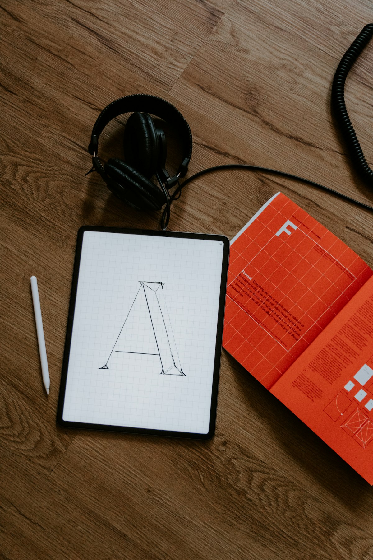
Mathematical alignment and optical alignment are not the same thing. A circle that is mathematically centred in a square will appear to sit slightly high, because the visual centre of a square is slightly above its geometric centre. Pointed shapes (triangles, letters like A and V) need to overshoot their baseline and cap height to appear aligned with flat shapes. Designs built on mathematical alignment will always feel slightly off to a trained eye.
Mistake 3: Too many focal points
Every composition should have a clear primary focal point — the first thing the eye goes to. A design with three or four competing focal points of equal weight gives the eye nowhere to start and nowhere to rest. The reader experiences low-grade anxiety without understanding why. The solution is hierarchy: one primary element, one or two secondary elements, everything else tertiary.
Mistake 4: Widows and orphans in typography
A widow is a single word (or very short line) at the end of a paragraph. An orphan is a single line of a paragraph stranded at the top of a new column or page. Both create visual holes in the text and signal that the typography hasn't been carefully set. Fixing them requires manual intervention: adjusting tracking, rebreaking lines, or editing copy. It takes time and feels like nitpicking. It's also how you tell a designer who cares from one who doesn't.
Mistake 5: Ignoring the edges
Most layouts are designed from the centre outward — the eye goes to the middle of the canvas and works from there. The corners and edges are designed last, if at all. The result: interesting centres, unresolved edges. Strong layouts are designed in full — the relationship between content and margin, the way elements approach or touch the edge, matters as much as what's in the middle.
Mistake 6: Starting with the computer
The computer makes iteration fast and refinement easy, which is why designers jump to it immediately. The problem: screens impose certain defaults — default typefaces, default colors, default spacing — and those defaults shape every subsequent decision. Sketching — even badly, even for five minutes — before opening a program forces the designer to commit to a concept before getting seduced by visual execution. The sketch doesn't need to be good. It needs to establish what the design is trying to be.